The Importance of Engaging Your Patients on Mobile Devices
By Jay Levine, president, PBHS Inc.
 Over the last year and a half, there has been a dramatic shift in the way people access information on the internet. Searches on dental symptoms, research on providers and online patient registration have increased as the methods patients use to find information have become more accessible and convenient. The shift from desktop computing to mobile device platforms has altered the internet landscape, and hence, that of your online presence. Is your endodontic practice engaging visitors with a website that accommodates mobile, tablet and desktop devices? If not, you could be losing prospective patients.
The latest data shows that internet users have passed the tipping point in desktop browsing.1 Time spent using mobile digital media in the United States in significantly higher at 51%, versus 42% for desktop browsing. The mobile-responsive AAE website shows comparable data as 52% of visitors to the website in the last year accessed the site via a mobile device, while 39% viewed it on a desktop computer. It also is important to note that consumers tend to utilize different devices throughout the day. Most weekday usage starts with mobile in the early morning, followed by desktop during working hours. Tablet utilization tends to be most popular at night.2 It’s easy to understand why it’s important for endodontists to cater to patients who access their website on any device!
To compound the challenge of having an older, outdated website, Google incorporates mobile-oriented website design as an attribute in its very complex search-ranking algorithm. Therefore, a website that is mobile-optimized will rank higher than one that is not. To see if your website adheres to these requirements, Google has provided an online diagnostic tool.
Google has stated that of the two mobile-friendly options – a separate mobile website or a mobile-responsive design – it prefers the mobile-responsive design. Websites developed by PBHS are built using responsive technology, a high-tech approach that provides an optimal viewing and interactive experience on any device. For consumers, this means easy reading and navigation whether they’re on PC monitors or mobile phones. One website for all devices!
In addition, a responsive website includes functionality that takes advantage of a mobile device’s technology, such as integrated call features, GPS map directions, social media app integration, secure form completion and even direct access to online testimonial requests. Be careful of vendors who try to sell you a separate mobile website or “mobile apps.” It’s better to have one website that caters to all users on all devices.
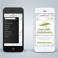
For example, the non-responsive website below would be viewed poorly on a small-screen mobile device. It would take a lot of inconvenient “pinching” and zooming to read the content on the page. By contrast, the responsive website would automatically respond and adjust to the screen size of the device being used by the patient, whether it is a desktop computer, mobile phone or tablet. Additionally, the website will automatically convert to a push-button menu with a phone call button for added convenience – no zooming, pinching or moving around required!
 |
 |
|
| A non-responsive website (left) requires the visitor to “pinch” and zoom to read the content, while a responsive website (right) automatically adjusts to the patient’s screen size. | ||
As stated earlier, Google rewards websites with higher rankings when they are responsively designed, use new technologies and stay up to date. It’s critical to not only appear on the first page of Google, but also in the top results of that first page. This enables the endodontic practice to compete more effectively and promote the authority of the specialty. Most importantly, patients stay better engaged on a contemporary, responsive website, creating a longer lasting and more satisfying online visit. The implications are quite clear. If you are unable to reach prospective and referred patients through mobile display or search, or you are not engaging your viewers with an excellent mobile experience, your potential patients may look elsewhere.
Jay Levine is president of PBHS, the endorsed website design and marketing firm of the AAE. More information on website design, search engine optimization, social media and reputational management can be found atwww.pbhs.com or by calling 800-840-5383.
Sources:
1. Kleiner Perkins Caufield & Byers 2015 Internet Trends Report
2. comScore Device Essentials
